SaaS UI Animation vs Traditional Explainer Video: Which Works Better?

A founder pulls up two videos from competing companies. One shows a clean, animated version of the actual product interface - buttons clicking, dashboards updating, data flowing in. The other uses simple illustrations and a friendly voiceover to explain the problem and solution, without ever showing a single screen. Both look professional. Both seem to work. So, which one should yours actually look like?
This is one of the most common decisions SaaS marketing teams face, and the honest answer is: it depends on what stage your viewer is at and what you need them to understand. In this article, you'll learn exactly how SaaS UI animation vs explainer video differs, the strengths and limits of each, and how to decide which one (or both) deserves your budget first.
Quick Answer: What's the Real Difference?
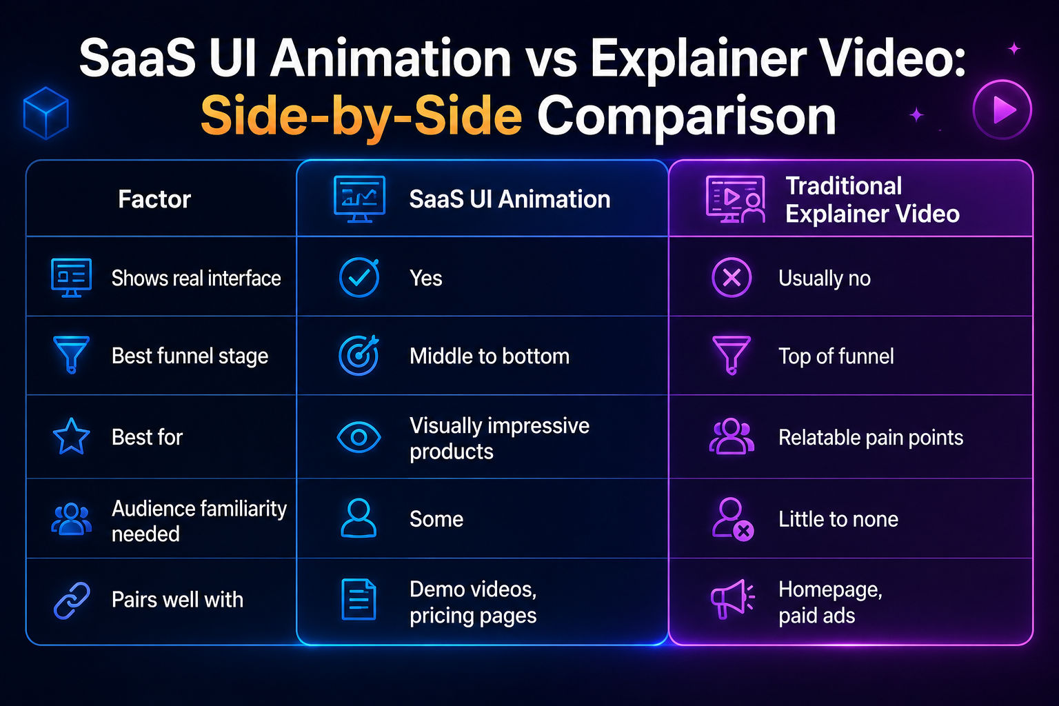
Before going deeper, here's the short version. SaaS UI animation recreates your actual product interface in animated form, showing real screens, buttons, and workflows. A traditional explainer video uses simplified visuals, metaphors, or illustrated characters to explain the problem and value proposition, without necessarily showing the product itself. UI animation answers "what does this look like to use," while an explainer video answers "why should I care."
Neither one is universally better. They're built to do different jobs at different points in a buyer's journey.
What Is SaaS UI Animation, Specifically?
UI animation takes your software's actual interface and turns it into a clean, controlled animation. Instead of recording a live screen (which can look clunky, laggy, or cluttered with unrelated elements), a motion designer rebuilds the interface as a simplified, polished version that highlights exactly what matters.
This works especially well when the product's value is genuinely visual - a dashboard that updates in real time, a drag-and-drop builder, a report that generates automatically. If seeing the interface in motion is the fastest way to understand your product, UI animation usually wins.
What Is a Traditional SaaS Explainer Video?
A traditional explainer video skips the literal interface and instead tells a short story: here's a problem, here's how it feels, here's the solution, here's the outcome. It often relies on illustrated characters, abstract visuals, or simple icons rather than actual product screens.
This approach works best when the problem itself is more relatable than the interface is impressive - think project management chaos, miscommunication between teams, or manual processes eating up someone's day. The video's job isn't to show software; it's to make the viewer feel understood before introducing the fix.
Why Some Products Need the Story First
If your product solves an emotional or operational pain point that most visitors already recognize, a traditional explainer video often connects faster than jumping straight into screens they don't have context for yet. Showing the interface too early, before someone understands why they'd need it, can actually reduce engagement rather than improve it.
Where SaaS UI Animation Has the Advantage
There are specific situations where UI animation clearly outperforms a traditional explainer approach.
When the Interface Itself Is the Selling Point
Some SaaS products are genuinely impressive to watch in action - a slick automation, a beautifully designed dashboard, a workflow that feels satisfying to see unfold. In these cases, hiding that behind illustrated metaphors wastes your strongest asset. UI animation lets the product sell itself.
When Buyers Are Already Past the Awareness Stage
For visitors who already understand the general problem and are comparing specific tools, UI animation answers the next logical question faster: "Okay, but what does using this actually look like?" This makes it especially effective on pricing pages, comparison pages, or later-stage landing pages.
When Pairing With a Product Walkthrough Video
UI animation often works as a shorter companion to a more detailed product walkthrough video. The animation gives a fast first impression; the walkthrough goes deeper for visitors who want more before committing to a trial or demo call.
Where a Traditional Explainer Video Has the Advantage
On the flip side, there are cases where the simplified, story-driven approach performs better.
When the Problem Needs Explaining Before the Product Does
If your target audience doesn't yet recognize they have the exact problem you solve, jumping straight to UI animation skips a crucial step. A traditional explainer video can build that awareness first, making the eventual product reveal feel more relevant.
When the Interface Alone Doesn't Capture the Value
Some SaaS products work quietly in the background - automation tools, integrations, backend processes - where there's not much visually exciting to animate. In these cases, illustrating the outcome (time saved, errors avoided, stress reduced) often communicates value more effectively than showing screens that don't say much on their own.
When You Need Broader, Top-of-Funnel Reach
Traditional explainer videos tend to travel well on social media and paid ads aimed at cold audiences, since they don't require any existing familiarity with your product category to make sense.
Can You Use Both? (Usually, Yes)
Most mature SaaS companies don't pick one and abandon the other - they use each for what it does best. A common structure looks like this: a traditional explainer video sits at the top of the homepage to hook new visitors and establish the problem, while UI animation appears further down the page or on a dedicated features page, once the visitor is ready to see the product itself.
This layered approach respects where the viewer actually is in their decision-making, rather than forcing every visitor through the same single video regardless of how much context they already have.
Frequently Asked Questions
Which is better for a SaaS landing page - UI animation or an explainer video? It depends on the audience. Cold visitors unfamiliar with the problem usually respond better to a traditional explainer video first. Warmer visitors already evaluating tools tend to respond better to UI animation showing the actual product.
Can UI animation work without any voiceover? It can, especially on pages where supporting text already explains context. However, pairing UI animation with a short voiceover usually improves comprehension, since it guides the viewer through what they're seeing.
Is a traditional explainer video outdated for SaaS marketing? No. It remains one of the most effective formats for top-of-funnel awareness, especially for products solving problems that aren't immediately obvious from the interface alone.
How long should each format be? SaaS UI animation typically runs 30 to 60 seconds, since it's usually focused on one workflow. Traditional explainer videos run slightly longer, often 60 to 90 seconds, to leave room for the problem-solution narrative.
Do I need both formats, or can I start with just one? Starting with one is fine, especially with a limited budget. Most companies begin with a traditional explainer video for broad awareness, then add UI animation later as the product and sales funnel mature.
Final Thoughts: Which One Should You Build First?
If your biggest challenge is getting people to understand why your product matters in the first place, start with a traditional explainer video. If your biggest challenge is converting visitors who already understand the problem but aren't sure your specific tool delivers, UI animation is likely the stronger first investment.
Either way, the goal is the same: reduce the distance between "I don't get it" and "I want to try this," as quickly and clearly as possible.
Not sure which format fits where your SaaS product is right now? Get in touch, and let's figure out together whether your funnel needs the story first, the interface first, or a combination built to match exactly where your visitors are in their decision.